Graph Visualization Techniques | ArangoDB: Insights & Tutorials
Using ArangoDB as your graph database?
you now have the opportunity to visualize your data graphically, using the “Graphs” tab in the admin interface.
In this post i will explain you how to do this:
Step 1) Configure the Interface
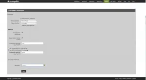
At first you have to configure the interface to display exactly the data you desire.
For the dataset you have two options:
- Select one vertex and one edge collection directly
- Select the graph by name created using the graphs api
- Manage your graphs
Then the interface offers you several advanced options:
- Decide if the graph is directed (only outbound edges are followed) or undirected (all edges are followed). By default we treat your graphs as undirected
- Define if you want to start at a random vertex in the graph. By default we will do that.
- Then you can define which of your attributes should be used as the label on the verticies. By default we will use the _key for this.
- Now lets bring in some colour. You can either use the same attribute for colouring as for labeling, but you can also use a different one
- Finally you can define a grouping of new nodes. This is useful to speed up the performance of the interface and to increase the usability. You can define a priority list of attributes here, which is elaborated from top to bottom: All vertices having the first attribute defined are grouped by its value. All other nodes are grouped by the second attribute if present etc.

Step 2) Search for your starting point
On the top right corner you have the well known filter icon.
After clicking on it you can search for your starting point with the byExample approach, define one attribte and one value and you will get the first vertex matching this pair as a starting point.

Step 3) Your first result
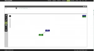
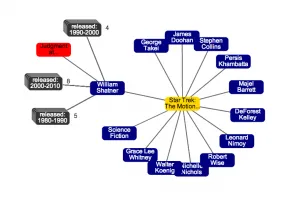
After the search you will be presented the selected vertex and its adjacent vertices.
These are grouped accoring to the priority list you defined in step 1).
If you want to readjust the configuration you can do so on the cog-wheel icon on the top right corner of the viewer.

Step 4) Interact with your data
On the left hand side you have the interaction toolbox.
This box offers you some tools to investigate and modify your graph.

- DRAG: Use this option to move around one specific vertex.
- VIEW: Use this option to see the properties of the vertex or the edge.
- EDIT: Use this option to directly move to the edit mask of a vertex or edge.
- SPOT: Use this option to explore your graph. If you click on a vertex all adjacent vertices will be added to the graph. Clicking again these vertices will be unloaded again
- TRASH: Delete the vertex or edge you click on. If clicking on a vertex all adjacent edges will be deleted as well
- EDGE: Use this option to insert a new edge between to vertices. Start pressing the mouse button on the source vertex and release it on the target button to insert the edge
- NODE: Use this option to insert new vertices in the graph. Simply click somewhere on the background
Step 5) Use the coloring
On the right hand side you have a colored list of values.
This list contains all values displayed in the graph and their coresponding colors.

Get the latest tutorials, blog posts and news:
 Skip to content